Guidelines on how to apply brand assets that shape the visual identity of NextEnergy. When in doubt, please reach out to kamiel.van.eeuwijk@nextenergy.nl.
Logo
Our logo is primarily purple, displayed on a white background. Or white/yellow displayed on a purple background. A white logo is used over images, video, and dark backgrounds.
Depending on placement, the logo can be displayed as one line or as two lines. The logo on one line is generally preferred if placement allows.


Spacing
Our logo is always placed at least one N away from the edge. Take into consideration that text, a different logo, or an image is an edge as well.
Scale
The smallest logo size allowed is 100 pixels wide for digital, 1.5 cm/0.59 inch wide for print.
Proportions
For most formats, our logo size is determined by the application’s width. From 1/4th to 1/8 of the total width, taking spacing into account.
Do's and Dont's
We use a white logo on dark or colorful backgrounds, and a purple logo on white or very light backgrounds. We never use our logo in black. We do not decorate the logo, or add perspective to the logo in 3D.
Logomark
The logomark in our logo represents a forward-thinking approach in energy. The vertical lines are similar to the bars found on an hourly energyprices graph. Together they resemble a fast forward icon, usually found on music players and is generally associated with ‘next track’, which symbolises the next step in energy.

Animation
The logomark can be animated on its own, but also as part of the entire logo.


Pay-off
Our pay-off is combined with our logo when placement allows for it. It works well on bumpers, as an outro, email header or when narrated.
Colors
This is the NextEnergy color palette. It should be used consistently across all branded assets.
The dark-purple, lilac, and yellow are our primary brand colors. These should be used 95% of the time as the main ingredients of the color palette.
#4a0091
C80 M99 Y0 K0
Pantone 2597 CP
#e3d7f4
C9 M16 Y0 K0
Pantone 2085 CP
#f5f49f
C4 M0 Y47 K0
Pantone 601 CP
The secondary colors can be used to highlight.
#00ba85
C92 M0 Y63 K0
Pantone Green C
Green is used for low prices, off-peak moments, and positive or confirming actions.
#ff9831
C0 M60 Y100 K0
Pantone 151 CP
Orange is used for electricity or as a warning.
#ffffff
C0 M0 Y40 K0
Pantone White
White is used as a background or as text.
Used as our text color.
Do's and Dont's


Typography
We use Roobert as our primary font in our communications in Regular for body text, Medium, or SemiBold for titles.
For Roobert, please use a line spacing of between 120% (titles) and 140% (body).
The font fits perfectly with the personal and acce nature of the company.
Roobert
ABCDEFGHIJKLMNOPQRSTUVWXYZ
abcdefghijklmnopqrstuvwxyz
1234567890€#@
Text styles
Our text styles are considered per medium where they are displayed on, for example: for advertising you might need short copy that grabs attention. While on an article, a calmer aesthetic is more suited.
Text sizes
Text sizes are also considered per medium. But in general, the different text sizes should always be in relation to each other. And calculated the same way.
We do this with a base size for our fonts. In all cases “1x” is the body font size from which the title sizes are multiplied.
For example: If a body text has a font size of 12px, then a title of 1.5x results in a title font size of 18px.

Do's and Dont's


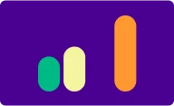
Shapes
These bars are fundamental to the brand, they can be used in conjunction with images or on a solid background. To further our brand recognition or to support a story. They could emphasize price dips, growth, or be applied in a generic manner.
Most notably the vertical bars in our logo and visual language that resemble the graphs from our app. They can be animated, masked, or outlined to match a concept or reveal additional imagery.


Do's and Dont's


Buttons
Buttons either have a pill-shape or no background at all. The copy on a button should be concise and clearly stating it's action. The button can contain text, an icon, or both.
Font Roobert and font weight semibold are used for the button label.
We distinguish three types of buttons, depending on the action or placement.
Primary
Holds the main action. Used for a positive, confirmatory and/or desired outcome. It's the natural continuation of a userflow.

Active state

Greyed-out
Primary /w icon and copy
Secondary
Used as a secondary action.

Active state

Greyed-out
Secondary /w icon and copy
Tertiary
Has no background. Can be an alternative to the secondary button. Used only in combination with a primary button, and is only positioned underneath the primary.

Active state

Greyed-out
Tertiary /w icon and copy
Do's and Dont's


Graphics
Supporting graphics are generally applied to a purple background. For instance on a hero section of a webpage, or as part of an ad. They provide context and support an otherwise copy-heavy creative.
They should never be used on their own and merely serve a supporting role. Blending in with the background they don't distract attention from the main message.


Do's and Dont's


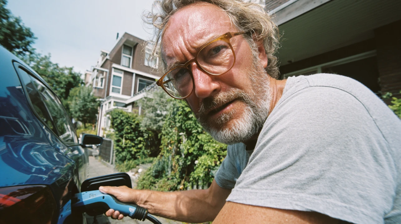
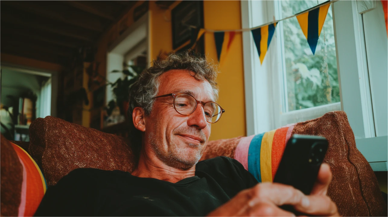
Photography
We aim to capture authentic moments of people in real life, also known as snapshots. We try to highlight a person or subject in a natural, unposed way.
The style is slightly overexposed images of real people. Imperfections in a shot add to a genuine feeling and avoid staged or fake imagery.
Stock photography can be used, but should be graded in a similar way. In the end, it needs to feel local/Dutch, relatable, genuine, and believable. Which can be a challenge when working with stock photos.
Diversity
When showing people, we believe in including a diverse and inclusive array of people in our content that is reflective of the Netherlands. Of all parts of Dutch society.
Aesthetic
A candid photograph, as if snapshotted with a throwaway camera, slightly overexposed with a warm and vintage color balance. Preferably shot in a vibrant environment. The shot should not feel produced or graded heavily. Experiment with extreme and playful camera angles.
Scalability
We try not to limit productions for one-time-use and create a sustainable library. Always question if it’s the right medium to tell a particular story and ask where this imagery is being used and how it can have the most impact.
When shooting photo- and videography where screens are visible in the shot, make sure the interface is blank, or easy to swap for another interface.
Examples


Phone mockups
When showcasing our app in lightmode, we use a clay white phone mockup. For showcasing our app in darkmode, a dark phone mockup is used.
Having a notch or camera lens visible at the top of the screen helps to portray the device as a mobile phone, and not mistaken for any screen (tablet or otherwise).

